The Professional Webspace of Designer and Illustrator Kevin Cornell:
"Design, Art, and Lackluster Humor."
Plight of the Aggravator
Every once in a while, I receive an email from someone entering the design field who is looking for a little advice. Being in the advertising industry, most of my contributions to society actually antagonize humanity as a whole — so I figure it's well worth trying to save my soul by helping my fellow man. Of course... they'd be using that helpful knowledge to destroy their own souls. Hmmm... I'm not even done my first paragraph and I've already got good grounds to abandon this article.
So I'll put it this way: if you're interested in some tips on starting out as a designer, read on. If you're like me, and you're hoping to get this year's Don Carlos Humanitarian Award (fingers-crossed!!!!), then go read... oh... this.
Helpful Pie Comes in Quarters
So... still with me? Well, here's four suggestions for the beginning designer to take to heart:
Look everywhere
For better or for worse, we are constantly surrounded by design. Carefully-crafted advertisements plaster the majority of structures. Every store creates some sort of identity in their signage. Television, Film, Magazines, Books, and Newspapers all have to pass through a designer's hands somewhere along the line. Start seeing the design everywhere around you. See it, and take notice of what fonts they choose, how they put text over the imagery, how they spaced (or didn't space) the information out. But most of all, figure out what that ad, or that sign, or that logo is trying to say to you; then take notice of how the designer chose to deliver that message. Once you start turning yourself on, and seeing the design around you — you won't be able to turn it off. And then you'll be learning on autopilot.
Design everything
I was constantly designing when I left school, if not for my work, then for myself. I made fake album covers for fake bands, redesigned brochures I found lying around just to see if I could do something better, and always kept a personal website. Design is really about learning "solutions" to "problems" — designing in a new medium teaches you both the problems and the solutions at the same time. Redesigning something someone else created might reveal the problems they experienced in designing, and forces you to learn the lessons they may have learned.
Learn Type
Design is almost always about working with type. Learn font shapes and font names, and concentrate on the details of how to use type, because the details are what separate the professional designer from the amateur. When working on a piece, it's not uncommon to spend 3/4 of your time on the small, typographic details that aren't even noticeable to most people. But that's what good typography is... it's invisible. No one notices it, because they're too busy reading it. That's how it SHOULD be. And be patient — an eye for type builds up over 2-3 years of constant practice. It'll come, you just have to keep at it.
One thing I can definitely suggest you do to start your education on type is read these three books (I've listed them in order of difficulty):
Design has a Reason
The last most important thing to remember about design, is that you need to have a reason for every aesthetic choice you make. Every line you place, every font you choose, every picture you include — there needs to be a good reason for why you put it there. Especially since someone might ask you why you made that decision.
Design has one sole purpose: to communicate a message. If you're choosing fonts and imagery that don't support that message, and you're using them just because they look cool, then you're making a mistake. You want your designs to be as simple as possible — so tight that every element on the page is necessary, and to remove one would make the rest of the design collapse. Again, this skill comes in time, and you learn it through experience.... so be patient.
Comments on this Article
There are currently 43 comments.
3. Pierce
"Once you start turning yourself on, and seeing the design around you, you won't be able to turn it off. And then you'll be learning on autopilot."
This is absolutely true, but there's a downside to it. It's quite invasive. I can't take a bus anywhere without evaluating shop signs. I can't sit down in a restaurant without judging the menu on clarity and aesthetic. It's relentless. And I'm not even really a designer. Just an interested amateur.
4. bearskinrug
Haha - that IS true. And suddenly you can't enjoy things you used to have no problem with, just because they become aesthetically annoying... :D
5. Pierce
There are whole ranges of products I can't buy anymore....
And even worse: ones that I do buy even though I don't particularly like them. Because of a good label.
6. Chris
The first thing that clued me into design was a book entitled "Smalltalk-80: The Language". I was so overwhelmed by the beauty of it. The next thing was record covers and the whole 4AD / 23 Envelope / Vaughan Oliver thing. After that came Emigre and Neville Brody.
All throughout this time I was a software engineer - only getting 'into' design when the internet turned up.
Once you start seeing design everywhere, you start coming up with design ideas all the time. I've even woken up with ideas; had them when showering. So my tip is: get a sketchbook.
7. Chris
I won't buy something if I don't like its design. It doesn't matter how good it might be.
9. Shaun Inman
I've been wondering what happened to this chap. So he decided to buy himself some proper clothes (I bet that tee is from Threadless), a portfolio and try to be a designer? His creepy mom and dad must be proud.
11. MAttLat
I'm a fourth year design student, and it's really come as a suprise how much I actually do notice design all around me. My friends all think I'm strange when I can name a font that something is using, or the first thing I notice when I pick up a product is that it's label changed slightly.
Actually, sometimes I think it's really wierd that they DON'T notice these things... it comes so naturally to me. But then, I remember that we're designers, and it's requirement to be somewhat off :D
(Thanks for those book titles, too. Typography can be a very frustrating thing.)
12. testMonkey
thank you thank you thank you. I teach design at a small college and my students look at me like I'm an idiot when I present these ideas. Having someone else back me up is nice. It's like you're my design posse. Word up.
13. bearskinrug
Mattlat - Yeah - it's funny when you're hanging out with non-designers... you say "Hey look - they're using Bodoni!", and your companion goes "Shut the fuck up."
Haha.. "Moms".... what can ya do!
Testmonkey - Count me in the "posse"... unless you're having a lynching. I have a weak stomach.
14. jason
Mattlat - Oh man, I catch myself doing that all the time... or bitching about how everyone is over-using the Papyrus font.. God, that font annoys the hell out of me now... *sighs*
15. MattLat
Jason - Me too! Whenever I see it I sort of sigh and shake my head. Or sometimes if I'm feeling particularly angsty, I'll growl and shake my fist, drawing even stranger looks from my friends.
16. zombiefactory
Typography always gets me. It's the one thing that scraps so many ideas I have when designing. Speaking of typography, is it just me, or has anyone else noticed the type change on Chevron and Dairy Queen signs?
18. Simon Zirkunow
That was a good read. I think it's very similar to learning to play an instrument. You suddenly realize what crap you been listening to all the years.
Even though I could not agree more on the importance of good (detail) typography, maybe I'm getting bitter on that one. The non-designers don't get the details while professional type designers and typographers would still find things amoung the details they don't agree with. (At least that was my impression while reading Spiekermann's book.) And from my experience, most cliends don't understand why they should pay for these extra 3/4 so I could work on the details that are irrelevant to them ...
Is my world about to collapse? Can I relax and get back to ragging lines? (I'm a design student and I would really appreciate your thouts about my concern.)
19. bearskinrug
Zombiefactory - Dairy Queen signs? For my own selfish reasons, I hope that's not too drastic a change...
Simon - Those are some good points. Type-conscious designers will always butt heads when it comes to details; and even the greatest amount of experience won't guarantee unilateral appreciation of your decisions. I would hope that the designer with typographical saavy would also recognize that there's no one true path in terms of handling type; and the most important end result is how that type is received by the target audience.
As for clients, the details might not mean too much to them... until you put those details into the perspective of: "Careless type = confused message = lost reader = lost potential sale". It is possible to educate your clients, and if they seem resistant to learning, it's also possible to find NEW clients...
20. Simon Zirkunow
Thanks for making that more clear. I think, your chain argument is a strong one that should convince even the clients who don't care about design at all. If not, they just might be bad business people.
21. testMonkey
"It is possible to educate your clients, and if they seem resistant to learning, it's also possible to find NEW clients..."
Let me get an Amen!
22. Steve
I'm happy to see the topic of typography come up again, because frankly, I just don't get it. I've studied it, and I've read Bringhurst. I wonder if typographers discussing the importance of typography isn't something like surgeons discussing the importance of surgery. (Most people don't need it). Before everyone starts getting excited and defending their craft, maybe we can focus our attention.
Sure, I see the differences in banner and heading fonts, of which there is infinite variety, but I'm particularly interested in body text, which is where I do my reading. Also, when a page is difficult to read, as are so many of the rebooters, I can see that. Aren't there just some simple rules for making body text legible? Use adequate contrast; pick a decent font; make it big enough; throw in nice leading.
When I read a book, and at the back it explains that a particular font was used because it is 'graceful' and easy to read, and it looks like Times New Roman to me, I wonder what I'm missing. Much of this study seems arcane to me.
23. RonaldB
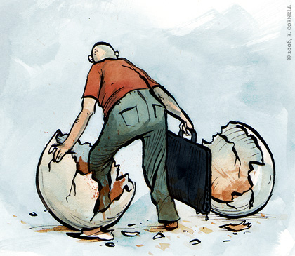
An excellent article once again, Mr. Rug, and a lovely illustration to boot.
It just seems to me that the designer portrayed doesn't look particularly "fresh" (bald, saggy but, spare tire...) for a newly born... er, hatched, and neither does the egg for that matter. Which would explain things...
24. sick of putting photos with text
Can I make a request?
I have been doing graphic design for 8 years now and am thoroughly bored with it. Will you post advice for an illustrator next? I am going to be involving myself alot more with the illustration side of things so any advice for the drawer/sketcher in me would be appreciated.
z.
25. bearskinrug
Steve - Yeah — there is a certain amount of mysticism when people talk about "appropriate" fonts, how their shapes compliment the piece and this and that. It's all very subjective... but at the same time, there is a common root. I think as a person becomes more and more familiar with the history of type (i.e. what fonts were popular in what era, how type was set in each particular era), it becomes easier to use type, and speak about type, with confidence.
But you're point about the simple rules for making body type legible... all those sound like pretty good rules. Provided your definition of "adequate", "decent", and "nice" are the same as the people you're laying out the page for. I guess that's the key - know how your audience likes to read.
RonaldB - Haha - yeah, he doesn't look like the most svelte designer... But then, maybe the late-night projects and $4.00 pizza breakfast/lunch/dinners took their toll before he graduated... ;)
SOPPWT - Well, part of me would LOVE to write that article, and the other part of me says "What?! How can you write that? You're still NEW!!?"
So we'll see how it goes. I can't promise an article like that will be next, but I would definitely like to write something to help someone who was in my previous situation (wanting to be an illustrator, but not knowing how to start).
26. Rob Mientjes
"And from my experience, most cliends don't understand why they should pay for these extra 3/4 so I could work on the details that are irrelevant to them ..."
Like Kevin already replied (but it deserves reiteration), you're not designing for your clients. You're designing for your client's clients. That sounds so wicked weird, but it holds truth like, uh, I dunno, true things. Yes.
27. Nathan Olsen
Those are great tips.
I think the best piece of advice one can give to any new designer is to learn to work faster. And then learn to let it go. If one has any aspirations of working in advertising, one needs to learn to turn around a concept in a day -- if not in a few hours. Heck, I once was given a half hour, and still have a scar on my finger where the xacto knife got me while building the comp (okay, so some deadlines are just plain stupid!). Learn to get the idea down quick, learn how to finesse the details within tight time constraints, then learn to live with the imperfections that are left. Rarely is one given all the time one needs to finish a job properly and the designers who shine are the ones who can make the job work in the time they're given.
28. RonaldB
By the way: slice #1 (Look Everywhere) reminds me of the "Design Vigilantism" article; I'm no designer, and never will be, but I have gone to some trouble to learn about design, type, etc. as much as I like and do find myself mentally "redesigning" poorly designed flyers, newspaper ads, documents, etc. sometimes.
The biggest design no-no I've seen recently is a shop sign in huge, awful freefonts type across the street from my house: I can't look at it with it annoying the heck out of me and thinking: "Loser!!! Couldn't you have forked out the dough for some decent lettering!!!".
29. Damien
Great article - my Wife & I run our web/email/graphic design company together - she's the designer / I'm kinda the tech/web guy & we have plenty of situations where she's out in public studying stuff & I'm like 'what the?' but I'm slowly getting it, spending more time learning about typography etc - maybe one day I'll cut the apron strings & design something worthy myself, who knows...
31. bearskinrug
Rob Mientjes, Nathan, Ronald B., Damien - Thanks gents!
Clayto - Uh....hmmmm
32. raymond
Kevin -
I concur that these are great little tips. I tell my student these things, too, and they laugh and look at me like I have two heads.
On a lesser note:
I have this annoying habit of finding typos. It's like "A Beautiful Mind", but instead of a Nobel Prize, I just feel like a horse's behind. Still...
Last paragraph:
"If you're choosing fonts and imagery that don't support that message, and you're using them just because they look cool, THEN you're making a mistake."
Sorry, had to do that. I'll go take my medication now.
35. kmf
ever since i've started to see design in the everyday world, i've become more critical of public advertising. i think i analyze every stinkin piece of public art, whether it be an ad, sticker, graffiti, architecture. No one tells you that this sort of thinking can become neurotic, obsessive and downright mind consuming.
but hey, that's why we're designers. did you know there's an arrow in the fedex logo? :)
36. bearskinrug
Nah... Treasurer is the title to have. Then you can embezzle funds...
38. howard
actually, the thing that separates the professional from the amateur is getting paid for doing it - plenty of professional designers wouldn't know a good use of type if they met it at a party and it was formally introduced to them by a vicar... or a novelist well known for introducing people to things - also, MORE BEARS!
39. scottydigital
Your statement about design being all around us is very true. And it SCREAMS at you at times. I find myself being very critical of pre-movie credits and book covers and billboards. It's a wonder my brain hasn't exploded by now.
40. bearskinrug
Haha - yeah... but what's funny about movie credits is how when they're designed well enough, they almost make a lousy movie worth seeing...
41. Hoops
A great example is the FedEx logo....there is an arrow pointing to the right in that font ,between the "E" and the "x". Once you see it you'll never NOT see it again.
42. lydia
As soon as i'm in town i'm gonna go 2 borders & find the books you recommended. (Ordering stuff on-line scares me!!!!!)

[ Back to Top ]
Search Bearskinrug:


Other Sections You Might Want To Visit:
- The Downloads Section: Wallpapers for the Discerning Desktop.
- The Links Archive: A Collection of Interesting Tidbits.
1. irene
Thank you so much! I am a second year graphic design student from Australia and I always love it when designers post information on their style, processes, and tips etc. Just a note to say thanks and keep it up!