The Professional Webspace of Designer and Illustrator Kevin Cornell:
"Design, Art, and Lackluster Humor."
Boiled Over Ideas
Just this very day, Andy Clarke released his new book, Hardboiled Web Design. This is notable for two reasons. First, because of learning being important, and this book being full of learning and all that stuff. Second, because I can finally share some of the gritty, dirty details of the cover creation process.
Now, as it happens, the good folks at Five Simple Steps already shared some of the thumbs I created in the initial brainstorming process. And Andy shared the roughs and the final cover art over on his site. Yet both of these groups actively withheld what I believe to be some of my better ideas. But, this being my site, and my own forum where I can share whatever art I want, my best ideas can finally see the light of day.
Three Completely Totally Awesome Yet Unfairly Rejected Ideas
From the start, Andy wanted to go down this hardboiled pulp-novel angle. You know, he'd be portrayed as this hard-drinking detective in a case involving a dame and some plug uglies and lots of tommy guns and shootouts and cigarette smoke and stuff. But I really felt we should explore a different angle, one where maybe we celebrate an Andy who doesn't need to resort to violence. An Andy who can perhaps take out two thugs with...
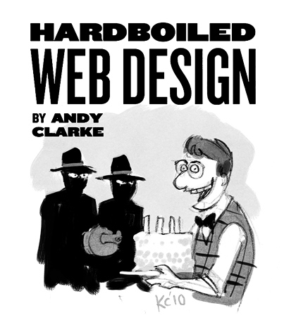
...the selfless sharing of a freshly-baked coconut cake. This is how you solve problems in the real world, and it's about time someone confirms that! But as you can imagine, Andy rejected it. And so it was no surprise either when he rejected my second idea, one that might not really have spoken to the content of the book, but it was definitely going to make the thing fly off the shelves. After all, who can resist...
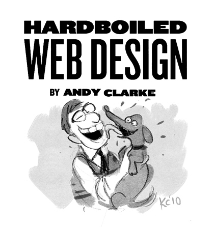
...a darling puppy! And this was just one take. There could be as many as three puppies on the cover here. And look how happy Andy is! This is the kind of man you want to take advice from! He's loving life!
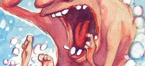
But, as you'd expect, Mr. Tough Guy was not on board. But I did have one more idea left. It's a little out of left field, but it definitely focuses on the hard-boiled angle, and it's got publicity stunt written all over it. This is the kind of cover that gets on the evening news, and puts books in backpacks. Even people who know absolutely nothing about web design would pay good money to see...
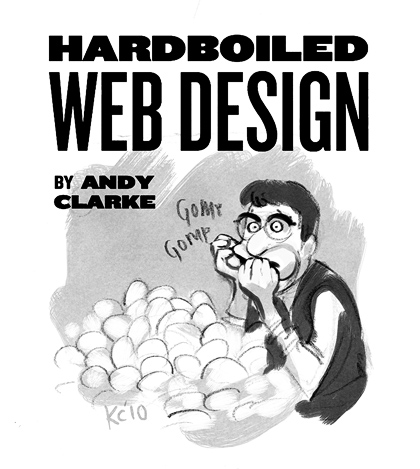
...a man eat 2,500 hard-boiled eggs in one sitting. Am I right or am I right?
But, obviously none of these made the final cut. Instead it's some hacky, predictable cover that looks like a book my grandpa would read. If you're interested you might as well go over and see for yourself. And if you buy the book there's also a poster that comes with it, at least for the first thousand or so buyers. I don't know why you'd want it. There's not even one egg in the picture.
Comments on this Article
There are currently 27 comments.
3. testMonkey
Oh, it's a tommy gun. Glad to know it. I just couldn't work out how those thugs were going to erase that cake-wielding rube with that large pencil sharpener.
4. bearskinrug
Yeah... there's people out there who might have stopped and looked at reference when they couldn't remember how a tommy gun was assembled.. then there are those of us who are out there, day after day, taking risks, and drawing things without reference and getting them horribly wrong. Some call us lazy. I call us... heroes.
5. testMonkey
Oh come nowI was just kidding. I mean, how else was I suppose to work the word "erase" into the comment?
Truce? Is this the spot in the show where Michael Scott would awkwardly say, "Let's hug it out, beeotch?"
6. bearskinrug
Oh - haha - I wasn't actually offended or anything. It is drawn wrong, after all!
7. testMonkey
Well you, sir, are a hero. (And my comment was indeedthough inadvertentlya bit douchey.)
I'll be by in the morning for that hug.
8. Jonathan
I read about the book on Andy's site and can't wait to buy a copy. Pity all your awesome ideas were rejected. The cover looks like a boys annual :P.
9. Cliener von Cleanskin
I know you’ll hate me for saying it, but I prefer the final cover to the rejected concepts… except for one thing: Malarkey needs to wear a bow tie. I think we can all agree bow ties add a seriousness and confidence to anyone all the more so if they spin and spurt water.
Sure it’s on sale already and sure people already have (PDF) copies but this one detail must be changed immediately and all non-bow tie copies must be destroyed.
Otherwise, I was expecting good things when I heard you were creating the cover but this is truly impressive. Nice one, Kevin!
10. prisca
Kevin,
loved seeing your iterations on Andy's site - was nice to see the progress behind another one of your masterpieces :)
But now, seeing your post here - that tops it ;) Love the one with the puppy, aw, how cute - would have made a great cover!
12. Brad
I bought the PDF, but I'd have bought four if the eggs cover had made the cut. Sigh. Bloody clients - they never know what's best for them.
13. Barry Jones
I prefer the darling puppy version!
I may just buy a copy of the book and staple this cover on it. Actually I'll just staple it on the front of all my books.
16. bearskinrug
Jonathan - A Boys Annual? I've never heard that term.... explain!
Cliener - I like your "cost is no object" approach to achieving quality. We should totally make a movie together.
Prisca - Score! Thanks, Prisca!
Justin - Making Webs Benedict?
Brad - 4 covers? That's 10,000 eggs!
Barry - Puppy covers: the opium of the publishing world.
Relly - Paul is going to hit me now, isn't he?
Aaron - Excellent! A gift pack of poster tack is on its way to you!
17. Opspraak
I say that cup/glass on the table does somehow look like an egg holder - you might've just gotten away with it mr. Cornell!
18. Jonathan
Bearskinrug, the Collins Boys Annual was/is (i dont know if theyre still running) a yearly book full of stories and cartoons for boys. here is a pic i found: http://www.theweeweb.co.uk/public/upclose.php?id=238
19. Andy Clarke
If you'd have presented me with a man eating 2,500 puppies, that would have been deal done!
20. Petra Gregorova
Where can I get those rejected ideas in print version? Those are just priceless. Not sure what Andy was thinking when rejecting those. Next time, do a survey and let us decide ;-)
22. Roger!
man, that illustration makes me want to be a web designer so bad! i guess i can settle for being a web user. does that make me the hot broad instead?
23. Frank Zweegers
Great illustrations man! You can paint! That's for sure :) Like you style.
24. Phyllis
As always, brilliant work - and I especially loved the rejected ideas! Ghaah! Clients! What can you do???
On a purely nit-pickety note - if the guy's sitting at his desk, how come his telephone is clear across the room on the far wall? Is that how he works off the extra calories from his booze and cigars diet? Or does he actually answer the phone from his desk? Drat, I must have dozed off in history class ... I could've sworn bluetooth wasn't invented until the late 60's .... ;-)
25. bearskinrug
Good question, Phyllis. See, the phone in the background is just a tchotchke from Restoration Hardware. He actually just uses his cell phone. See, people from 70 years ago were just like us!
26. Phyllis
Yes, I wax nostalgic over early Victorian smart phones - so quaint with the polished wood and leather trimmings! :-)
BTW, it gave me a giggle when I realised that, if the guy behind the desk is a hardboiled web designer, that means the lady in the red dress must be an over-wrought, emotional client. "You ... you bastard!! I told you to make the images darker *and* brighter!! And why didn't you use the template I sent you? Why??"
hee hee hee ...
27. Frank Zweegers
You have amazing blog and I love your post. Thanks for sharing!

[ Back to Top ]
Search Bearskinrug:


Other Sections You Might Want To Visit:
- The Downloads Section: Wallpapers for the Discerning Desktop.
- The Links Archive: A Collection of Interesting Tidbits.


1. Karl Habegger
That sounds nice, but what I'd REALLY like is a nice softboiled web design. It is nice with some toast cut into strips and a mug of Harvey and Sons tea. Maybe a slice of honeydew melon... I'll be right back.