The Professional Webspace of Designer and Illustrator Kevin Cornell:
"Design, Art, and Lackluster Humor."
My Baptismal Font
This week Veer released Phaeton, my first contribution to the world of fonts. I can now attend typographer soirées. If anyone is throwing one of these anytime soon, send me an invite. I'll wear my "I like my punctuation well-hung" shirt.
If you've ever made a font, you know how much work it is. Fortunately, I don't. Because I was lucky enough to have teamed up with Mr. Randy Jones in the creation of Phaeton, which made it significantly more fun and less stressful. It was a good match-up, because brains are like chewing gum.
I shall explain.
Yes, brains are like chewing gum. Chewed chewing gum to be exact. And the way you learn, is by throwing the chewing gum on the ground, and whatever filth sticks is "knowledge". Whereas I have been throwing my chewing gum hither and thither, with little regard for where it lands, Randy has been diligently rolling his in the dumpster outside All-You-Can-Eat-Type Buffet.
Why don't I give you a little tour, and I'll explain things on the way. You drive.
What the Hell Is A Phaeton?
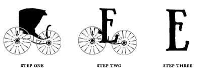
Most people don't realize this, but at one time, the way we think of cars today is how people thought of carriages. Meaning, there was just hundreds of different types of carriage, all with different names. People probably hung out on the corner, with a tin of snuff, admiring the new '02 Broughams, or reminiscing about the backseat of their old Box Jump-Seat where they first got a glimpse of Zelda Potter's sensuous elbows.
I mention this, because carriage lore seems to be one of the random pieces of filth stuck on my chewing gum. And as Randy and I went through the process of trying to decide what sort of font to pursue, I disentangled this particular hair from the bundle, and — Lo! — we both found it to be good. We chose the name Phaeton, for two reasons. One, the proportions of the Doctor's Phaeton were a nice inspiration for our letterforms, and two, it sounds much better than Child's Seat Drop-Front.
Cooking Delicious Hamburgevons
As with any successful team, Randy and I each had separate roles to play in the creation of the font, yet both of us were familiar enough with the other's contributions to offer advice, ensure a good exchange of materials, and just generally respect what the other was doing.
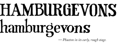
My role was essentially to create unique and legible forms, reminiscent of type from the bygone era of the carriage. Randy, an excellent letterform designer in his own right, was there to spot inconsistencies in the forms, fix problem areas, offer conceptual advice, and then translate them to an actual font.
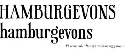
His role, in my opinion is the difficult one. Don't tell him that.
The Filth of Forms

Years ago, I was required to take a Philosophy class. Honestly, very little from that class stuck in my gum. But one thing I do remember is Plato's concept of Forms, the concept that everything has this ideal form that exists... well, somewhere not here, and the world we live in is like some sort of cosmic diorama filled with imperfect copies of ideal trees, people, figs, monkeys, scratch n' sniff stickers, etc., etc.,
Which is an idea with some merit, at least when it comes to explaining why all these very different things...
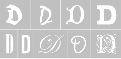
...are all the letter "D". Inherently, we understand its ideal form and thus recognize all these outrageous variations.
And so we hit upon what I found to be the most difficult part of this whole process. You'd think I'd spend hours and hours laboring over the A's and B's and the 123's. Nope. I actually spent the most time on the characters I use with the least frequency, just trying to figure out just what the hell their ideal form is. I mean... how many people know what this is?

I certainly didn't know. And how could I be sure that making it look like this...

...didn't suddenly make it totally meaningless? And where do you place it in relation to the baseline? How small can it get? How big? So I'd have to spend a lot of time researching the history of characters, and divining their contemporary usage.
Oh - and in case you didn't know, this...

...is a "Q". It's used in words like "Quality!" Neat!
Catchwords If You Can
From the start, we knew we wanted the font to be not just pretty, but useful. And so we put a lot of time and thought into those rarely seen characters like I mention above, but also in the creation of catchwords, swash variants and ligatures.
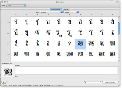
Here was yet another place where Randy was like some sort of typographic messiah. I initially only drew up the english catchwords. Randy translated and created all the foreign language variants. And while I did draw up swash variants on all sorts of characters, Randy had to select and refine the ones that would actually work, and then create similar variants for all the lowercase, and the ligatures. This was happening early this year, around the same time I destroyed my back, and only got two hours a sleep a day while daily doses of oxycodone removed any capacity for quality assurance. So make sure you thank Randy, or else you'd be using these catchwords:

Vignettes
Of course, being a guy who draws stuff, one of the things I couldn't resist doing was including some vignettes, to help reinforce the general feel of the era, but also to honor some of the nineteenth-century's most famous individuals:
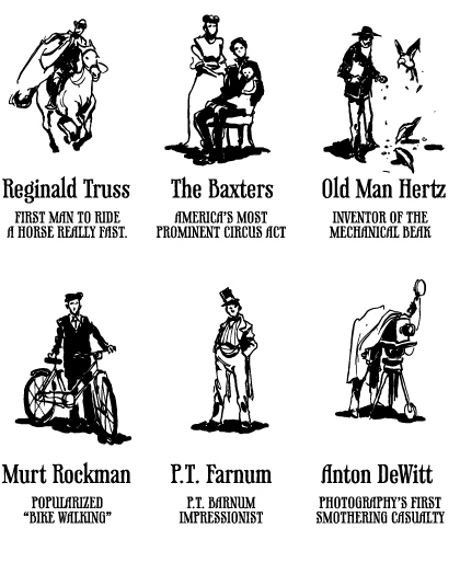
Okay, so, none of these people are real. But if they were, then you couldn't make up stuff about them without leaving yourself open to some sort of slander suit. That's the beauty of fiction. You can lie all you want!
And so ends my tour of Phaeton, though I have to say I didn't even get to share half of what I wanted. But the thing is, what excites me about creating a font, is finally getting a chance to make building blocks for other artist's creative endeavors. So I've tried not to burden you with my thoughts on its usage, or my intentions. I'm waiting to see what you do with it. So go on. 'Git.
Throw your gum in Phaeton.
Comments on this Article
There are currently 45 comments.
2. bearskinrug
Hmmm... honestly, I'm the farthest person removed from the usage with regards to the font. I'd say your best bet is contacting Veer directly. I'm not sure if that's something they've considered or not, but it they haven't, it'd be good for you to bring to their attention.
3. testMonkey
All attempts at snark aside, this looks amazing. Well done, sirs. Well done.
5. James McEwan
Wonderful font sir. Come pay day this month I will be purchasing this right away!
6. paul
Really beautiful work. I kind of wish the original, rough version was included as well, but hot damn! I love how much character is embodied in those...characters. Just like my burger, this is extremely well done! Almost burnt!
7. Randy
@Matt - Veer has oddly buried their License Agreement on the Umbrella Collection page. After a quick non-legal perusal, it doesn't speak to @font-face directly, just PDF embedding which is allowed. I've asked Veer for clarification and will post it here for completeness.
@Kevin, how come I never saw the sciatic catchwords? Seriously useful. Next time.
8. Aaron
I've been reading this blog for a while now and have always, always loved the way you hand-render type faces in your drawings. Now a version for the masses is available for purchase! High marks! Bravo! (Said in an old-timey voice, of course)
9. Randy
@Matt - No @font-face under the current EULA, but they are reviewing the policy. It looks like sifr would be allowed as it is an "embedding" solution. Kevin's advice to ask Veer directly is probably good even for @font-face, as you may be able to get special dispensation. They are nice people and will gladly put some filth in your gum.
11. Steve K
Trying to fight the urge to buy it just for the sake of owning it but I believe that is a battle that I'm just going to lose. Or win!
12. John Fredrickson
Thanks so much for sharing your process. It is really cool to see how you drew your inspiration and how that ended up translating into the final typeface. Fantastic work.
13. Will B
ohh Definately a must have for the ol' font collection, any chance of some prints from the collection in the shop? Anton DeWitt has been my hero for years!
14. Will B
ohh Definitely a must have for the ol' font collection, any chance of some prints from the collection in the shop? Anton DeWitt has been my hero for years!
15. The Colonel
My only regret is that this wasn't ready for the redesign of Slantmouth.
By the way, Kevin, the portrait illustrations worked out GREAT!
16. glindon marten
I'd buy this if I wasn't recently rendered unemployed. I love organic looking fonts like this. Great stuff. I hope you make the early rough stage Phaeton available too, maybe if you don't want it associated with the refined "Phaeton" you could just call it "Hamburgevons" mmmmm, hamburgevons...
17. kevadamson
I saw this earlier. Didn't realise t'was yours. Well done sir. It's magnificent :)
18. Toasterhunter
Excellent work, and angelic-looking serif's...seraphs...whatever.
Curious. There happens to be a faux-real person named E.B. Farnum.
http://www.hbo.com/deadwood/cast/character/ebfarnum.shtml
19. Cliener von Cleanskin
Ha! I see through the charade. If this font genuinely dispensed the wonders so claimed then surely this whole site would immediately have been reworked to use it and only it!
Otherwise, very impressive work. Your style is very neatly captured in the feel of the font.
20. Drunksockmonkey
really nice font. Erik Spiekermann would be proud (if he knew you) (or you him)
i like the process. wanna add some "Step 2" glyphs into the font?
by the way, what is that... ass-end-of-a-rocket-thank-heavens-its-not-the-other-end looking glyph that you said you didn't know (which implies you now do). do tell.
21. Gerren
Kevin - I'm pretty sure that the character you asked about (the circle x thing) is the universal currency symbol. It is almost never used.
Note - CSS3 is not supported by all browsers yet, and anyone wanting to add special font faces should definitely use sIFR. I love it, and I use it on my website. If anyone needs a hand setting it up feel free to email me.
22. Gerren
Oh yeah, congrats! you are no longer a font virgin. It even looks good too...
23. bearskinrug
Yep - it is the general currency symbol (I hid the answer in the title tag). For the benefit of anyone else, think of it as kind of a... currency sign FPO that people use.
24. Gerren
HA! I didn't even notice you did that. Go me, knowing all of the redundant special characters...
25. Design Monkey
Tremendous! I look forward to purchasing this delightful piece of typograhy once I have built its cost into a client's over-inflated budget!
26. Justin Marcucci
Kevin - The font is great. I just bought it and am going to use it immediately for a stuffy corporate golf event we are doing the collateral for.
One question, how do i access the glyphs - what is the keystroke (and, the, etc...)? Using AI and PSD?
Great work.
27. bearskinrug
Well, on a mac, I access them through the Character Palette, which can be turned on in System Preferences > International > Input Menu, turn on "Character Palette", and then at the bottom there's a checkbox to put the input menu in the menu bar.
Convoluted, but this is how I access everything.
28. Richard Rutter
Wonderful letterforms aside, I love the cartwheel and fluerons you've included. Beautiful job Kevin!
29. Clarity
I was taken on a journey and at the end, fell out of the carriage, laughing. Most unlady-like. It's a beautiful font,
Crikey, please change that "Immortalize Me!" below, far too much pressure.
30. Randy
Hey Justin, the user's guide will be posted at Veer shortly, but in the mean time you can grab it from my site (700kb PDF). That will give you the scoop on using the open type features. And thanks!
31. josh
I must say, Kevin, I do agree with the general consensus - the refined version is great and will have a broader commercial appeal, which will bring you millions and the opportunity to fire yourself and go paint provocative letters on the walls of corporations - but the slightly more organic original version appeals to those of us who like to roll around in raw materials.
32. Phyllis
Huh. I thought Old Man Hertz had invented the Rent-a-Beak ... Goes to show how our public schools are failing our children in Fictional Historical Figures. Sad.
34. Kmart
Love love love the walkthrough. This is fabulosity. Also had to reblog through my tumblr your little diddy about chewing gum. Smashing.
35. Juani
What a great work you've done here! I really admire your drawings but this is really impressive!
36. Vivian
Argh, you forgot some french catchwords, especially "du" (it means "of the" in french)!
Nevertheless, good job.
37. Mike
Killer stuff! Just wanted to confirm that the vignettes are included with the font before pulling the trigger on the purchase.
39. Florian Pichler
I just had to come back to you and thank you for that great and inspiring font. I just bought it and it looks like it will be perfect for my next project.
40. Anne
I'm so excited to see that you put out a font!
Not only is it beautiful, but it also reminds me of my beloved regency romance novels. So double kudos to you!
41. Brendan
Your font is stunning. It stopped this design naif in his internet surfing tracks.
42. Stephen Rapp
Thanks for posting. Its lovely to get a peek into how some conceives their work. Brilliant!
43. Stephen Rapp
Thanks for posting. Its lovely to get a peek into how some conceives their work. Brilliant!
45. mary
=/ eh.
I thought the vignettes were real... reading your articles is like being april-fool-ed. In October.

[ Back to Top ]
Search Bearskinrug:


Other Sections You Might Want To Visit:
- The Downloads Section: Wallpapers for the Discerning Desktop.
- The Links Archive: A Collection of Interesting Tidbits.




1. Matt Wilcox
That's a really nice font, congratulations on it :)
Question: Under what licence would someone be buying it? I can't see anywhere on the site which tells you the rights you'd have when buying it - for example, can you use it for font-embedding with CSS3's @font-face?