The Professional Webspace of Designer and Illustrator Kevin Cornell:
"Design, Art, and Lackluster Humor."
A Cornell/Dalkner Dissection of Style
There's a lot of Black & White Illustration out there. And as human beings, with eyes, we've probably casually glanced at a good amount. Now, some of us with eyes may not really have any need to know the imminent information; to you, fair citizens, I give warning. This article may get a little nerdy. But to anyone who works in the same industry as myself – the industry of makin' stuff – it's time to increase your knowledgity. Or Knowledgoment. Knowledacity. Hmmm... better just ignore that sentence and move on.
You see, while there's a lot of black and white art out there, there's also a fair deal of vagueness as to how that art was made. And with the popularity these days of recreating a period feel, it just might be helpful to the designer or illustrator to have an understanding of these different stylistic veins. So Designy Joe can say "I want to recreate some 18th century engravings", instead of "I wanna use some old art" when talking to Illustrator Fred. And on Illustrator Fred's end, if he understands just what an engraving looks like, and how it was created, he'll know there's no way he's reproducing one with his black sharpie marker, no matter how technically proficient he is. He can immediately tell Designer Joe to shove it.
Pen & Ink
Most of us are familiar with this style. If you ever took art classes, you probably had to do a little Pen & Ink. Consequently, when you see Black & White illustration and consider how it was made, your first instinct is to probably assume someone drew it, with the same tools you used in Intro to Drawing. But that's not always the case. In fact, if the art in question has a period feel - say it's in a book of Victorian Clip Art — the chances of it being Pen & Ink are pretty improbable. See, in the first few eras of commercial art, there was no way to reproduce Pen & Ink. The only way to create a Pen & Ink illustration for a book would be to... hand draw it in every book. And that's pretty inconvenient. So tuck that knowledge in your back pocket — it'll help you decipher technique simply by where and when it was printed.
Woodcut Illustration
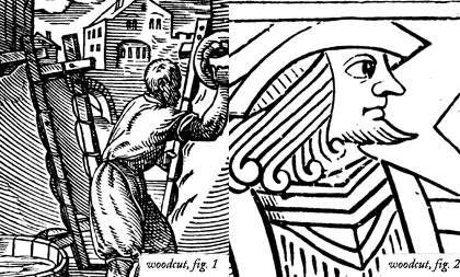
This may be the easiest method to decipher. Woodcut has a rather chunky look. The two examples above are as fine and detailed as you can get, but pale in comparison to later methods for reproduction.
As you may already have figured out, you create a woodcut by... cutting wood. Think of it as making a stamp. You take the ol' carving tool, and everything you scrape out will be your whites. All the little "plateaus" of wood left over will be your blacks. You spread some ink over the carved side of wood, and then press it onto paper. Voil�! Woodcut.
So, knowing how this is done, you can see why it yields such thick lines. If a plateau got too thin, it would just break right off — if not before printing, then pretty soon after. One other clue that a printed image is a woodcut may be visible grains. When carving, it's easier for the artist to scrape out the wood with the grain — but if he doesn't, you'll see the telltale "rings" in the dark lines.
There's also a similar method of creating an image called Linocut. This is really the same process, except instead of using wood, you would use linoleum, or a thick piece of rubber. You could probably get thinner lines with these materials, since it's a bit more flexible; and you wouldn't have to work with the grain to scrape out your white areas. But keep in mind, this is a more contemporary method. If you're looking to really replicate Renaissance (or even Pre-Renaissance) art, woodblock is the way to go.
Engraving
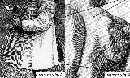
Now, here's where deciphering starts to get difficult. When I first left the design world to pursue illustration, one of the first "jobs" I had was a set of old-timey scenes reminiscent of the late 19th century. I had an idea in my mind of how this was supposed to look; I would just do a really detailed pen & ink.
After a couple tries, I realized that I needed some reference, to see just how the turn-of-the-century artist used their lines to create such a detailed image. After gathering a couple things, and confirming visually the style I was thinking of in my head, I realized — there's NO way I was going to succeed. Because the style I was looking at was an Engraving.
Pull out your wallet. Take out some paper money. Now send it to me. HAHA! No — I'm just joking (send it). I don't know what denomination you have in your hand, but I have a one-dollar American Bill. This is an engraving. Look at the criss-cross linework in ol' George's jacket; or how the lines follow and form the contours of his face. That is some crazy detail! And what's even more impressive is that because of the nature of how you print engraving, there's no "reducing" to get finer lines, as you could do with pen & ink — that's printed at actual size.

So, now you've seen some good examples of what engraving looks like, a little knowledge of how the image is created might reinforce your ability to identify it. Now, first thing you need to understand, is that the method of getting the ink onto the paper is exactly the opposite of woodcut. Instead of ink collecting on positive areas (the original surface), it collects in the negative areas (the areas you gouge out). So in essence, everything you scrape is a dark; everything you leave is a white.
Now, how does the artist form those wonderful parallel lines? Well, the material the artist engraves into is metal. Zinc and Copper were the common "plates" used in antiquity, because of their durability; any metal can be used, however. The artist uses a tool called a Graver or Burin, which is basically a metal rod with a pointy end, and the tip is sharpened at a 45° angle. The graver is designed to cleanly shave out the negative areas — it's actually removing the metal from the plate, using only mechanical means. So what you'll notice about engraved images, is that the lines are very sharp (especially if the metal used is copper), and they start out thin (where the graver enters the metal), grow thicker as the artist puts more pressure on, and then thin out as the graver comes back to the surface.
Sounds like a pretty time consuming process, eh? Well — you're right. Some engravings might take up 3-4 years before they're finished. Which is appropriate. I'm sure that after the first 2 years of scraping, you get pretty timid about creating more lines.
So now you have a couple of clues on how to spot an engraving, and maybe even on how to recreate one. The engraving technique has been in use since the early 15th century, so it's another viable style of illustration from the Renaissance up to the 20th century. If one were skilled enough, I suppose they could recreate the style using a crowquill pen, so there were thin entry and exit points, but the line could widen. Remember to work in parallel lines, describing the form. And if the drawing were reduced quite a bit, it would look very fine. One important point to remember, is that there would be no large patches of black, since that would require a very deep and wide recess on an actual plate, and ink wouldn't have the surface tension to remain suspended in such a crack.
This seems like a good spot to end this article too — I've dropped a whole lot of info on your head. The next installment deals with Etching — a process very often confused with Engraving. I'll also talk about some other methods that are basically iterations of either the engraving or etching process. In the meantime, why don't you take a nice long nap. You've earned it.
Notes
Thanks go to Peter Dalkner for his knowledge on reproductive processes. Hmmm. That sounds bad... PRINT processes.
I assure you, if there are discrepancies in this article — it's probably my fault. Please feel free to comment if I've glossed over something you wish to know more about, or if you've got points of your own to add.
» Read Article II.
Comments on this Article
There are currently 25 comments.
2. bearskinrug
Your RSS would have just tricked you anyways... Long articles like this I tend to post, then take down again to fix all the things that went wrong. So you probably would have seen nothing when your reader first "dinged"...
3. Anders
great stuff as usual, but I think I'll stick to Illustrator or Painter for our stamp assignment...I clearly don't have 3-4 years :S good knowledge for future reference though...
4. Bryan
Sometimes you whip out a semi-serious article and it scares me.
Good reading though.
7. Hilmerrr
Nice teaching there, you teacher-you.
Now tell me, wich bookcase took longer to draw,
Black or White ?
8. bearskinrug
:) The white books actually...
They weren't white enough so I had go back in with white ink to erase some of the darks...
10. jordan
Pen and ink was invented by the devil himself. I'm moderately ok if I'm copying something, but that's about it.
11. R.R. Anderson
Smashing, rather smashing and a perfect opportunity to mention one of my favorite Irish illustrators: Harry Clarke. Harry Clarke, Harry Clarke, Harry Clarke!
12. Juna
Thanks for the informocity. I love the look of really well done woodcut and engraving. The really good ones look like they take forever. Good to know they only take a few years. Wow! I think I will stick to pencil, scanner and computer. Thanks.
13. Sophie
Viola ! Woodcut.
I can easily see a musical instrument pop from nowhere, and disappear a few seconds later to reveal a woodcut hidden behind it.
You must mean Voilà ! Woodcut.
14. bearskinrug
Hah Hah!
Good catch, Sophie! You win a Viola!
And R.R. - I had come across Harry Clarke's work while I was researching this article. So I will echo you, if I may... Harry Clarke, Harry Clarke, Harry Clarke.
16. Zeik
funny coincidence, we just finished a block print project in art at school (woodcut or linoleum). but as my teacher doesn't actually teach, thanks for shedding more light on the black and white process. (i personally am blown away by escher's work. i originally thought he did all that in pen, but then when i found he did all that carving out of wood--true genius and unbelievable skill.)
17. mearso
Very succinct and interesting. Look forward to the the Ecthing Installment.
18. tony
good work! i like wood & linoleum carving too. once done it myself. its fun, but it takes a little too long for me: i am an rather inpatient individual. anyways, ever heard of pieter brueghel den oude? another dutch master, now we've started about them anyway....he's done some excellent work. search for the temptation of st. Anthony. that is defenitely my favourite.
19. Dan Mall
Great post, Kevin. My interest in illustration has recently been revived, and I'm looking into taking some illustration classes at school, so this post came right on time.
Any advice for designers that want to get into illustration, either for the first time or again?
20. Mr. david
Kevin,
First time posting here, but after your enlightened article... I felt, well... COMPELLED. You do a great service to not only designers, but to illustrators all across the board. Well done. I applaud you and your reckless shenanigans. Not to mention that delightful sock primate's. Keep up the excellent work. But for Christ's sake:
MORE BATMAN REFERENCES!
Yours,
Mr. David
21. bearskinrug
Dan - I could expand on this subject quite a bit. I'll try and say this simply, though. The quickest advice I could really give would be to really take an objective look at your skill, and encourage the things you're good at. You do not need to be a technical, realistic genius to be an illustrator. You just need to deliver a message.
Mr. David - Thanks! :)
22. Matt
Dont forget potatoes.
Although when I was making the counterfiet bank notes (as you suggested in your article), they tended to be fairly mouldy by the time I'd finished the type engraving.
25. Misty
Someone probably already mentioned this but I just had a note on woodcuttings. Albrect Durer did some crzay detailed woodcuts in the late 1400's. Check out his 'Apocolypse' series in particular. No chunkiness whatsoever.

[ Back to Top ]
Search Bearskinrug:


Other Sections You Might Want To Visit:
- The Downloads Section: Wallpapers for the Discerning Desktop.
- The Links Archive: A Collection of Interesting Tidbits.



1. Anders
this time I forgot to start my RSS reader, but in search for new comments on the previous one, I guess I got lucky...now make with the reading! :)