The Professional Webspace of Designer and Illustrator Kevin Cornell:
"Design, Art, and Lackluster Humor."
A little change never hurt 'nobody
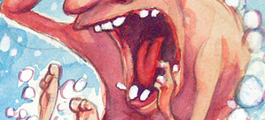
I recently got the chance to do a second cover for Design-In-Flight — the April 2005 issue. Many of the articles revolve around the theme of 'Change'; exploring change in job, changing the way you market yourself, changes in design trends, and changes in how to protect your work.
So I set to my brainstorming tasks, which involves a lot of cursing, crying, and sometimes arson. But — as always — ideas came. They were then bounced off the usual advisory board, and the concept of design as play-doh was approved. So, from there I just worked up a couple sketches, and then moved on to a watercolored ink drawing. The piece was finished in photoshop, and then sent off to DIF.
Six-Penny Anthems
I also contributed a comic to this issue; and what's more, each subsequent issue will feature my comics under the shiny new name 'Six-Penny Anthems'. So look for me in future issues, unless I anger DIF management with my frank depictions of nude Batmen and such similar themes.
This issue's particular Anthem is an eight-panel piece titled The Designer's Aptitude Test. The idea for the comic actually came when I was talking to a schoolteacher friend; I was trying to explain the frustration of dealing with design clients, and I used an 'educational' metaphor so he might better understand. Then he let me grade a couple tests. I drew a couple smiley faces, some stars, and a snoopy giving a thumbs down.
So... it's a magazine about airplanes?
Haha...no, silly reader. It's about design! This issue has some interesting articles on designing grids with the golden section, some solid font reviews, techniques for marketing yourself, and an excellent article on successful interviewing. Intrigued? Well, visit Design-In-Flight and pick up a copy for yourself (or, if you're a little wary, feel free to just download the sample), and make sure you check out my contributions. It's a damn good read, chockful of advice — and if I do say so, it's a mighty slick-looking publication to boot.
Comments on this Article
There are currently 13 comments.
2. Anders
oh, it's in PDF...oh well, PDF technology hasn't arrived here yet, so I guess I'll have to make do without it :P
3. bearskinrug
On the bright side, Anders - you have TONS of marsupials. I gotta work pretty hard to see a pouch around HERE.
4. John Nick
Pouch Document Format?
Awesome work Kevin. Especially love the Designers Aptitude Test. It doubles as a software developer's aptitude test as well.
Anything subliminal on the cover?
5. bearskinrug
Well... now that I kinda look at the play-doh piles on the left... I kinda see a phallus... and the "glans"...
Oh dear... looks like I'm a creep after all...
8. Anders
now, seeing what you've discovered, your answer to me makes a lot more sense... :S
10. John Nick
YIKES!
Were you involved with that kerfuffle over the poster for The Little Mermaid too?
Sometimes a tower is just a tower.
Hey, if we type "glans" a few more times you'll probably enjoy even MORE traffic from Google.
11. murten
Jessie = you can download the .pdf from design-in-flight, or just send picture postcards from LA.
Nice work Kevin, looks pretty slick. :)
12. jessie
I've seen the sample...but what if i want to see THE WHOLE magazine???
*runs hysterically through the room*

[ Back to Top ]
Search Bearskinrug:


Other Sections You Might Want To Visit:
- The Downloads Section: Wallpapers for the Discerning Desktop.
- The Links Archive: A Collection of Interesting Tidbits.










1. Anders
I hope I can get it here in Australia... :(